# DetailsView Overview
The DetailsView is used to display a single row from a data source, typically a collection such as a List
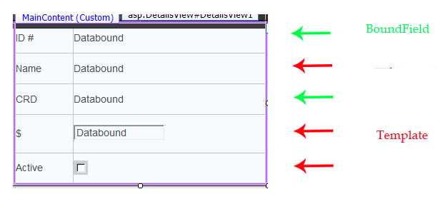
We will discuss two popular techniques used in customizing a DetailsView, BoundFields and Templates. The BoundField is generally used for read-only displays. The default display format is string. You can assign various formatting patterns to your data. When used with the EditUpdate command button, the BoundField will be displayed within a textbox. The Template column allows for a more refined customization of the DetailsView data property. There are several types of template columns: ItemTemplate, EditItemTemplate, AlternatingItemTemplate, InsertItemTemplate, HeaderTemplate and FooterTemplate. You must supply the content display or a basic standard web control (such as textbox, drop down list, checkbox) when setting up a template.
You may have a co mbination of boundfields and template columns within a single DetailsView. When you do customize your DetailsView, set the AutoGenerateColumn property to "false" (default is "true") or you will get both your customized columns and the default set column setup.
A DetailsView is ideally used when your data source has 3 or more data properties to display for a row. If you have only 2 data properties (description and an associated value), consider using a drop down list. The DetailsView is an appropriate control to consider when each collection row can be view in isolation from the next; such as pages in a technical manual or the specifications of a specific part in a products catalogue.
Since the DetailsView displays a single row from a collection, paging is needed to transverse through the collection. The control has built in paging capabilities. These capabilities include the most commonly used paging symbols and styles found on the net.
The DetailsView contains several command buttons which allow you to isolate a piece of data from the control; Insert, EditUpdateCancel and Delete. These buttons can be added to the control and will appear at the bottom of the control. These command buttons are implemented in events on your web page.
# Data Source
The DetailsView data can be attached in several ways. One common technique is through a data source such as an ObjectDataSource, SQLDataSource, XmlDataSource LinqDataSource or EntityData Source. Another technique is through code. DetailsView allows only one technique to be used at a time. The default order of data property rows on a DetailsView is the same order as data members appear in the attached data source. You can, however, alter the order of the rows when you customize the DetailsView. You do not need to reorder your data source to match the desired order of rows as they appear on the DetailsView. The DetailsView matches the data source member (field) name to the supplied datafield name given to the DetailsView row. Additional data source members not used by the DetailsView are ignored. A common error when customizing a DetailsView is using a datafied name that does not exist in the data source.